McLaren Group
Evolving a Legend
McLaren is a storied brand that revved into life as a car racing outfit by Bruce McLaren in 1963. Today, McLaren Group is a global name in cars and racing, comprised of three main branches: McLaren Racing, McLaren Automotive, and McLaren Applied.
In late 2020, McLaren approached Newlyn to improve their logo and word mark and bring it into alignment with a refreshed company outlook.
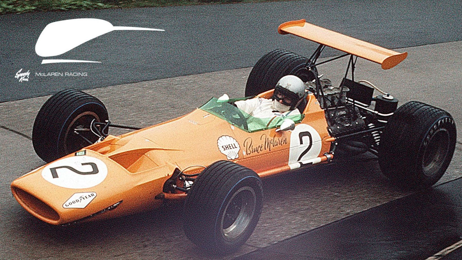
Bruce McLaren’s Original M7A, 1968
A New Look for A Legendary Brand
The brief was pretty clear: take the McLaren mark out for spin, and find out how to make it a more optimal machine. McLaren Group was looking to realign with a younger audience with a lighter, more agile mark while remaining rooted in their deep racing heritage. The McLaren team mindset was shifting to a perspective of “lightness and speed”. The challenge was to refine the current mark in this direction while keeping the demands of the global brand’s communication in mind.
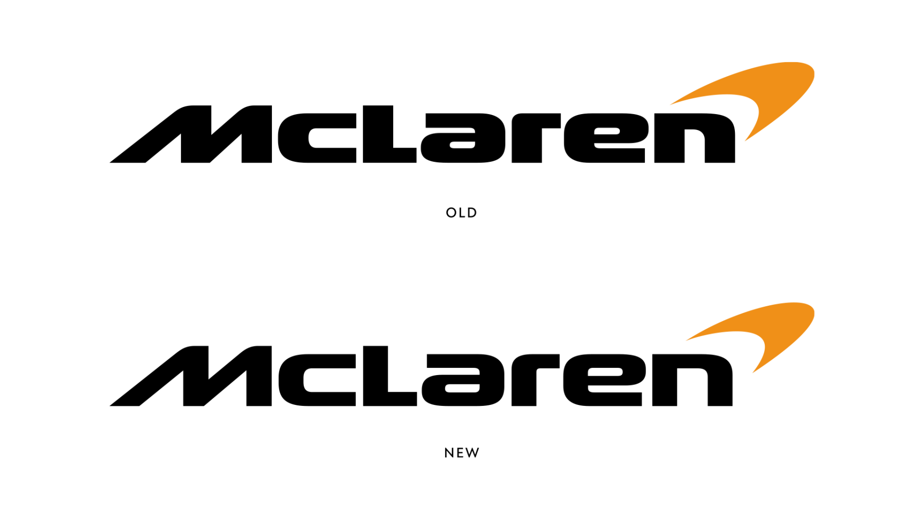
It was clear from the get-go that something wildly different wasn’t going to make it off the starting line. So, we settled on an evolutionary approach, initially exploring many new directions, changing everything about the letterforms (particularly the a and e), but each of those iterations got to a point where it lost the spirit of the original mark.
When it comes to evolving brands, it’s always best to identify and harness the strengths of the original mark and what made it so special and endearing. The old logo is really wide and really heavy, which says it’s got lots of power, but perhaps not as much speed.
McLaren, a brand steeped in rich heritage.
Evolution Not Revolution
The current mark looks like an engineer made the letterforms, not a type designer, which is not altogether bad. It certainly exudes the heritage of the early days of race teams just doing things themselves. But, it was time a type designer had a look at it to ensure the mark works as a coherent set of individual letters each with their own demands and unique features working together in a unified mark that communicates the right energy.
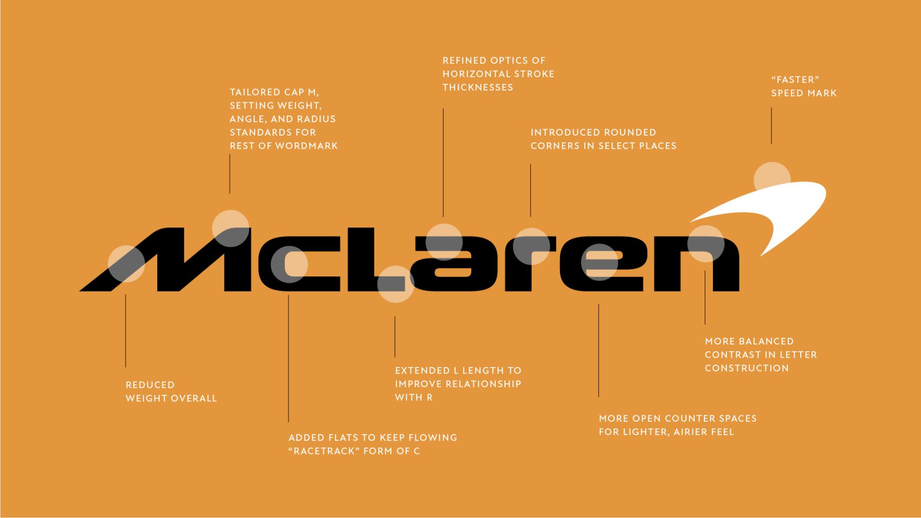
Significant improvements were made to the McLaren Logo
The old logo had a few issues. We started by correcting those then taking the word mark to the extremes of the grid upon which it was drawn. We tinkered with lighter weights, narrower and more extended widths, and different levels of contrast, but also size of radii, more open counter spaces, and the grace and speed of the curves. It was important to do all of these things without losing the soul and spirit of the original letterforms.
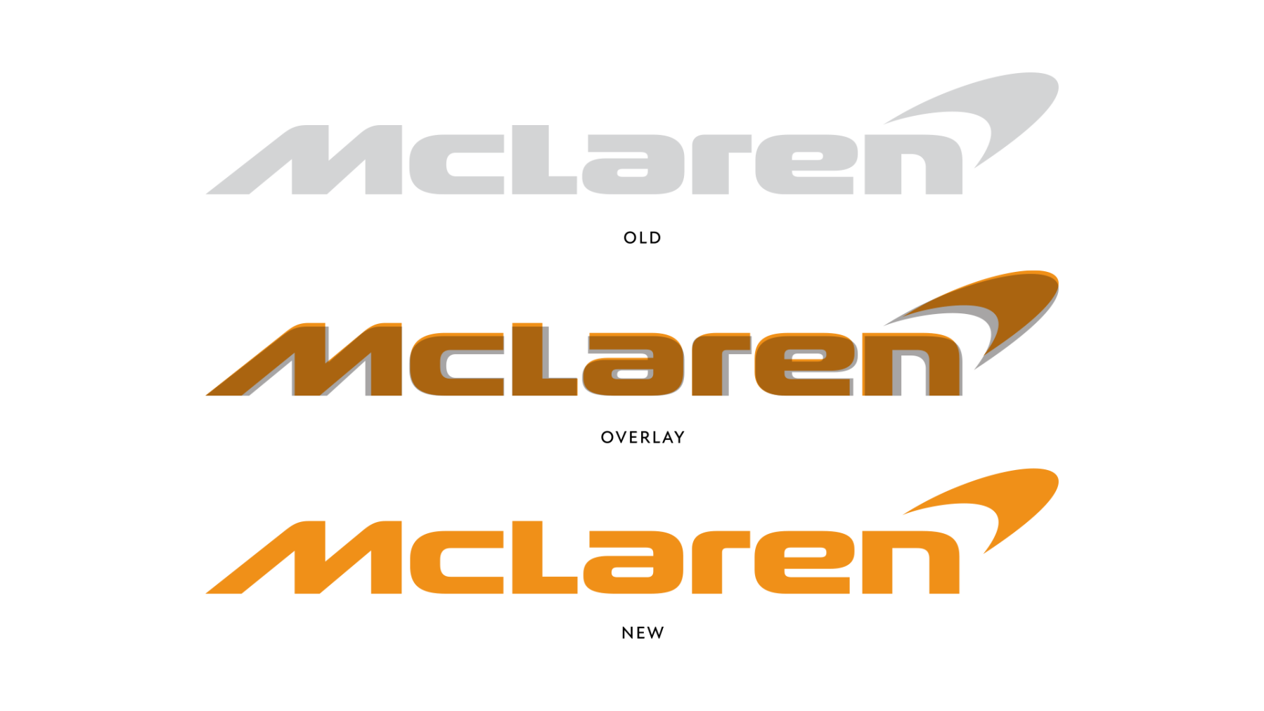
The “Speed Mark” as McLaren calls it was also considered as a part of the wordmark itself. The iconic ball of energy at the end of the wordmark has become a recognizable symbol in itself. It too needed a touch of “lightness and speed” to match the new wordmark, a fitting evolution from its once angular geometry.

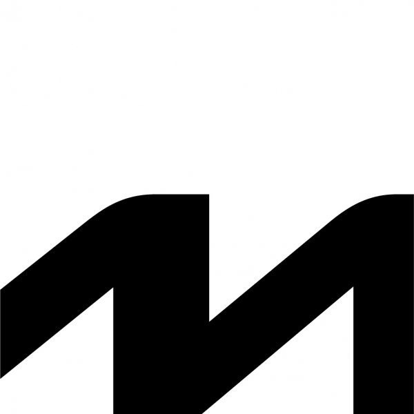

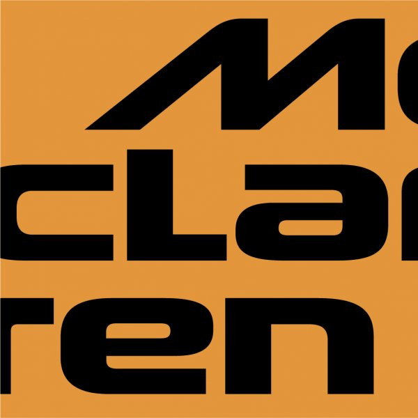


We also looked deeply at both the application and audience for the logo. We knew this logo would not only be all over the track on race weekends, but displayed at scales ranging from gigantic jumbotron screens to printed company communications and mobile instances of only a few dozen pixels. (not to mention all over the cars zipping around the track.) Streamlining the word mark for the full range of McLaren Group applications was a top priority.
You also don’t want to alienate the fans. McLaren has a deep heritage and history, and a passionate community around the globe. Everyone is so familiar with the mark, and the brand, and we feel anyone who has invested themselves in an emotional level with the McLaren world would still recognize and love the evolved mark.
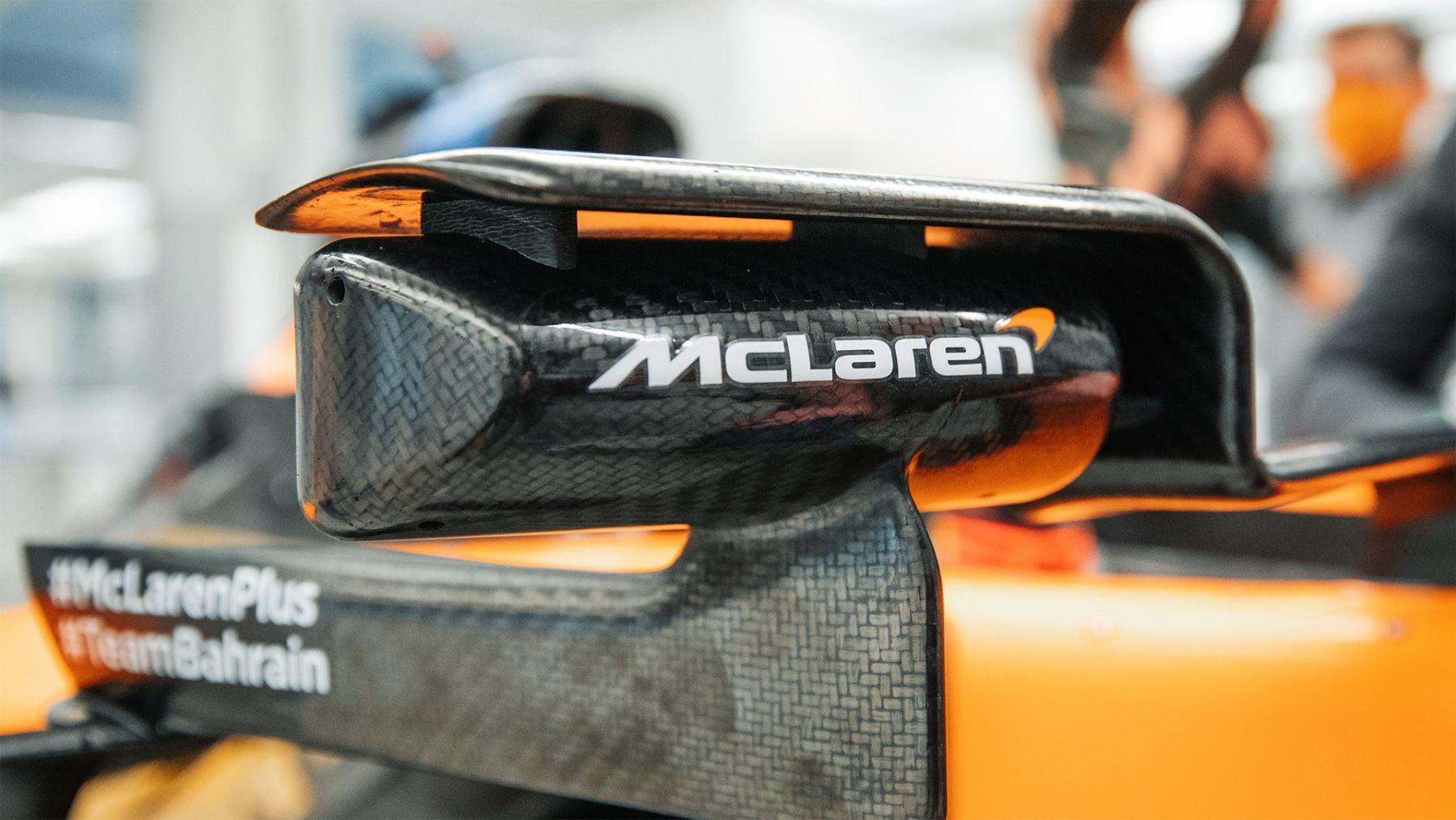
A Lasting Legacy
Overall, we believe this logo to be a worthy evolution of the McLaren wordmark, preparing it to stand up to the demands of a new era of global brand communications. We just love how it retains the energy of the previous mark, while adding some fresh air to the McLaren livery.
We wanted to ensure the client felt in control. Working collaboratively with the McLaren team to understand the context and importance of the brand’s mark produced a result that rings true with their goals and desires and reflects how the McLaren group sees themselves today, tomorrow, and down the road.
When you’re working with a heritage brand, the designer is awarded with deciding what’s important and what’s not. That’s not a responsibility to be taken lightly. Needless to say, we’re looking forward to watching the brand take off from here, and the new word mark zipping around the track on race day.