Burger King Logo Design: Long Live the King
n 2020, Miles Newlyn worked with Jones Knowles Ritchie on the Burger King rebrand, refining the new Burger King logo, standalone wordmark, favicon, small-use version and international localisation.
The project was not a reinvention from nowhere. Burger King already had one of the most memorable visual ideas in fast food: a name held inside a burger. The task was to make that idea work again with more warmth, confidence and control — across signage, packaging, digital systems, advertising and global brand applications.
In 1978, when I was nine years old, I was a regular reader of the British comic 2000AD. Every week I’d look forward to reading about the antics of my favorite character Judge Dredd, a law enforcement officer in the dystopian future city of Mega-City One.
Panel from ‘Burger Law’, 1978, Copyright 2019 Rebellion 2000AD Limited
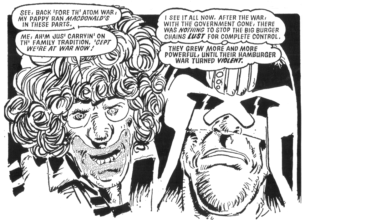
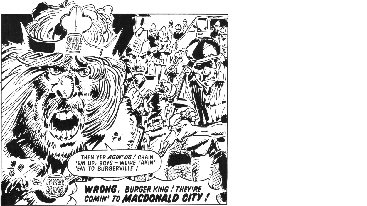
The stuff that you’re into as a kid tends to have a profound influence on your later life, and this was certainly true of one particular episode in this comic that captured my imagination like no other—‘Burger Law’.
Panel from ‘Burger Law’, 1978. Copyright 2019 Rebellion 2000AD Limited.
‘Burger Law’ was the story of big burger chains at war in a post apocalyptic America in 2100. My nine year old mind had no concept of brand, mascots, loyalty, or anything like that until this point. And then here it all was, ‘brand loyalty’ expressed in the most extreme form imaginable – tribal bands of renegade customers led by wild leaders, a clown on one side, a king on the other, fighting beneath flags bearing logos! I loved it.
I’m not sure what my takeaway from this was, I didn’t see it as a critique of consumerism or corporate power, it was fun, irreverent and bizarre, but I liked one leader more than the other. 👑
At this point in time I’d not tasted a burger of any kind, it would be another decade until I first got my first real taste.

Piccadilly Circus, 1993
As a graphic design student in London I treated myself to a Whopper meal in the Burger King at Piccadilly Circus beneath the iconic neon advertising. I made it a regular thing, making sure I got a window seat overlooking the stature of Eros, around which London’s cosmopolitan blend of humanity would revolve. I never went to McDonalds. Ever.

Berthold Block Type Specimen, (image courtesy of Stephen Coles, Flickr)
During meals at various BK joints the world over, I’ve spent many happy hours analyzing Berthold Block, the typeface used on all of Burger King’s posters and menus. (I’ve learned a lot from this 1908 typeface by Hermann Hoffmann, the result of which was our very own New Herman, a modern interpretation of Berthold Herold, another of his designs.)
Imagine my joy, forty three years after reading ‘Burger Law’, being asked to help rebrand Burger King.

Burger King Signage, 1970s
The Burger King rebrand brief
Jones Knowles Ritchie, an agency responsible for a string of amazing rebrands in recent years, got in touch to talk about refining a logo they’d done and adding some localizations. The team had already got the logo to a really great place, and the colour palette was perfect.
New Burger King Logo, 2020
Refining the Burger King logo
Initially I was tasked with refining the logo, making a standalone wordmark, a version for large signage, a favicon and a small use version. The type had a wonderful ‘ketchup’ quality to it, and the Gs looked like they were both enjoying burgers themselves. There were a couple directions to explore, one softer without any straight lines, the other simpler. The simple route was quickly chosen, the spacing was more successful and it scaled more easily.
New Burger King Wordmark, 2020
Drawing the Burger King wordmark
For the wordmark it made sense to use the lettering of BURGER and draw the three new letters in those proportions. I did a little work on the favicon, but as the team already had some great ideas, I made only one by rebalancing the weight and width of the initial B and K within the bun.

Localising the Burger King identity
Once we’d all agreed final versions of the logo and wordmark, it was time to move on to non-Latin localizations. To date, we’ve completed the Chinese localization. I worked with TienMin Liao, and we’d have liked to have put the Chinese logotype within the burger, but to keep the English version iconic it was decided to make a lockup using a lighter letterform.
New Chinese Burger King Wordmark, 2020
My favourite thing about the Burger King logo is that it is a burger. No explanation, no abstraction, no doubt. That is a powerful strategy for trust and certainty.
The success of the mark comes from how compact and complete it feels: the name, the form and the appetite all wrapped together. Good logo design often works like this. It does not merely identify a brand; it makes the brand easier to remember.
Explore more logo design and brand typography by Miles Newlyn.

Burger King Rebrand Team
Agency: JKR
Global Chief Creative Officer: Tosh Hall
CEO, North America: Sara Hyman
Executive Creative Director: Lisa Smith
Creative Director: Christian Widlic
Design Director: Justin Fines
Senior Designer: Daniel Stettner
Senior Designer: JiYoon Cha
Senior Designer: Taylor Childers
Senior Designer: Regina Puno
Designer: Jackie Rodriguez
Implementation Designer: Linda Strong
Logo Design: Miles Newlyn
Type Design: Colophon Foundry
Illustration: Cachetejack
Senior Copywriter: Joe Schott
Copy Director: Morgan Doff
Head of Motion: Dan Kennington
Group Account Director: Jenna Portela
Account Director: Owen McAleer
Senior Account Manager: Izzy Taaffe
Head of Strategy: Gavin May
Strategy Director: Christopher Allen
Print Production Director: Stephen Kwartler
Senior Production Designer: Miguel Altagracia
Senior Production Designer: John Colón
Global Communications Manager: Jackie Sumsky