New Atlas: Small is Beautiful
It’s important to look at specimen books in the real, rather than scans. Scale is a defining principle of type. Scale is not merely a measure of size but a measure of meaning. Perceiving scale allows us to situate ourselves between the vast and the minute. Looking closely, tiny imprints of ink transform into monumental masterpieces. Upon close scrutiny, what was invisible when reading reveals a transcendent experience on the architecture of thought. Small is beautiful.
A couple of years ago I was looking at the 1924 Stephenson Blake specimen book for inspiration.
Smallest of all, on an isolated page, fading into obscurity, was Booklet. I fell in love.

Origins of Booklet
Booklet appeared in Stephenson Blake specimen books in the early 20th century, with the italic attributed to Eleisha Pechey (1831–1902) but cut posthumously in 1904 by the master punch-cutter William Kirkwood.
The design was released in just four text sizes – 6pt, 8pt, 10pt, and 12pt – Roman and Italic. It’s one of the very few typefaces limited to small sizes. A 1937 Stephenson Blake catalogue described Booklet and Booklet Italic as “companion faces” to Athenian, praising them as “of great use in the display of dainty circulars, programmes, business cards and stationery…in all work where delicacy and refinement are essential.”
Unfortunately, much of Stephenson Blake’s archival material was stored in poor conditions in the foundry basement, nicknamed the Tomb. Damp and mould eventually forced the preservation of drawings and records in deep-freeze storage, making research into Booklet fragmentary at best.
Detailing: Original vs. Revival
The revival captures the overall texture and feel of Stephenson Blake’s Booklet but does not hesitate to adapt. In the specimens, flourishes were inconsistently applied—sometimes over-exaggerated, other times under-defined.
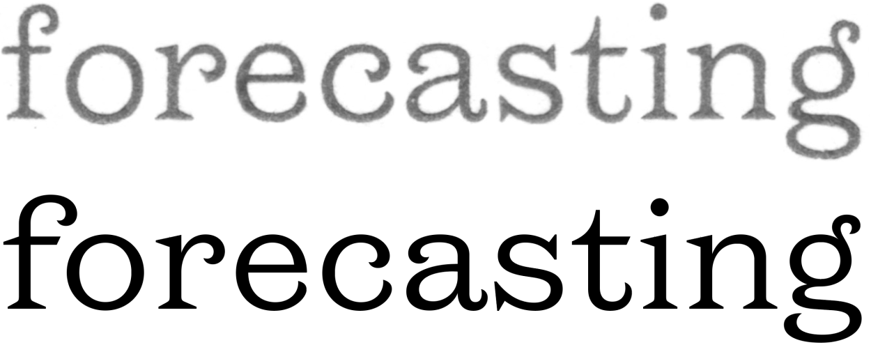
The redrawn g is a good example: its open loop and balanced proportions integrate naturally without demanding undue attention.
The subtle hook of the f was removed, with its flourish extended.
The flourish of the c and r were smoothed for consistency.
The process involved filtering rather than suppressing historical details—one of the core challenges of this revival. The overarching goal was always to reinterpret an outdated design into something slick, modern, and consistent, while repeatedly asking: what is best for the design?
Capitals vs lowercase
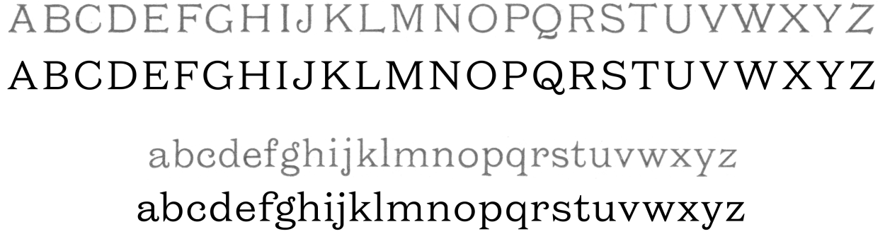
The capitals in the original specimen did not harmonise with the reconstructed lowercase. They leaned towards a semi-monospaced look, with oversized E, F, T and L spanning the width of the H. Baseline serifs on V and W felt awkward and dated compared to the cleaner lowercase.
In the revival, detailing was simplified wherever possible. Crisp, straight lines were prioritised over irregular angles. For instance, the E, F, T and Z lost their protruding top and bottom serifs, replaced by more generous, tightly bracketed serifs. The result is a capital set that matches the polish of the lowercase, while shedding the dustiness of the original.
Weights Range

Booklet was released in a single weight, but making this design useful today meant expanding the range with functionality in mind. The Regular weight is based on a blend of the 8pt and 10pt specimens, producing a light, airy, relatively low-contrast texture optimised for reading. At the other end, the Black features a wider frame and higher contrast—idiosyncratic of the Latin genre, and better suited to display and headlines than text pairing. By extending the spectrum, the revival allows for carefully tuned middle weights, tailored for specific uses and contexts.
Small Caps
Booklet was issued with small capitals, so there was no way that we were going to miss out these gems of the typographer’s trade. To be used anywhere that capitals feel too shouty, or in acronyms within text. They also provide a classical text rhythm when mixed with old style figures.

Italic
The original Italics were an eclectic mix of cursive and upright corrections, with flourished terminals from the Roman swapped for ball terminals. The result was fussy and not entirely suited as a counterpart to the considered Roman.

The revival keeps the 17-degree angle of the original but sharpens the vocabulary:
Harder angular head serifs from the Roman carried into the italic.
Baseline serifs removed from the lowercase
Cursive final strokes on n m h i l j, echoing the terminals of c s a.
Brush-like elements added to w v x z.
The double-storey /a was preserved and updated—unusual in italics, but vibrantly textural.
The result is an italic that complements the Roman’s restraint while adding variety and energy.
Discretionary Ligatures
In addition to a full set of ligatures that prevent the lavish terminal of the f from colliding with the dot of the i or ascender of the following letter, there are discretionary ligatures for ch, ct, it, and st.
Historical context
New Atlas captures a delicate chapter in British type history: a transition from Victorian flourish to modern clarity. A typeface that bridges the ornate excesses of Victorian design and the modern boldness of the early 20th century. We were not only able to preserve Pechey’s and Kirkwood’s contributions but also created a family that feels authentic to its origins while suited to 21st-century use.
Booklet was nearly lost to damp archives and mould damage, remembered only in scattered specimens. Today it speaks again with the refinement Stephenson Blake once promised.
👉 Download the trial fonts and see how New Atlas can bring elegance, delicacy, and modern utility to your design projects.