Fonts with square wheels go faster!
Designing New Science, a square typeface system inspired by Eurostile, Microgramma and the technical optimism of twentieth-century Italian lettering.
New Science began with a simple observation: much contemporary brand typography had become too similar. Walking through London, looking at billboard after billboard, I started thinking about the kind of typeface that could still give a business a distinct, confident voice.
The answer led back to square typefaces: to Eurostile, Microgramma, Nebiolo, Tipoteca, and the strange authority of letters built from softened rectangles. New Science is my attempt to refresh that language for contemporary brand typography: precise, stable, technological and unmistakably useful.
Picture this: I’m strolling through London on my way home, looking at all the billboard typography. I notice that it has all become very similar, that most brands have forgotten how to confidently own a typeface.
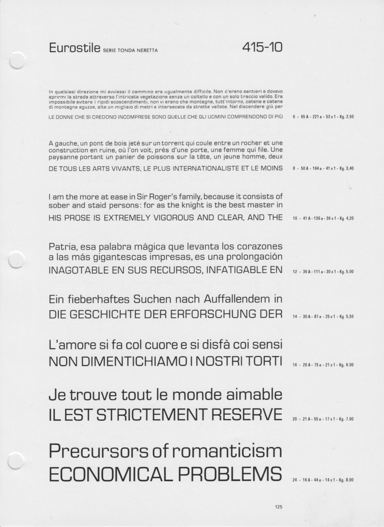
Anyhow, that got me thinking, there’s been a few 'square' typefaces, but only one comes to mind – Eurostile - why is that? When I finally got home I took a closer look at Eurostile, and found that the lower case o wasn't as square as I thought it would be, it was quite narrow. I'd also expected it to be monoline, but the vertical lines were way thicker than the horizontal ones, definitely not what I had in mind. So, my mission became clear - share the square.

In the larger sizes the letters become increasingly condensed. I prefer the wider proportions of the smaller sizes.
Now, for some serious research! I headed to Tipoteca, the amazing type museum in Cornuda, Italy. The museum holds the majority of the Fonderie Nebiolo archive. Eurostile was designed by Aldo Novarese, a legendary type designer who was the director of Fonderie Nebiolo. Let me tell you, it was pure bliss. I spent hours sifting through Eurostile specimens, in the cool of the museum’s reading room, while the Italian sun roasted outside. Here lay the masterpiece, a collection of deceptively simple shapes – small miracles that I needed to fathom. I wanted to figure out what it was that made Eurostile a towering typographic monument to everything that is precise, advanced and undeniable.
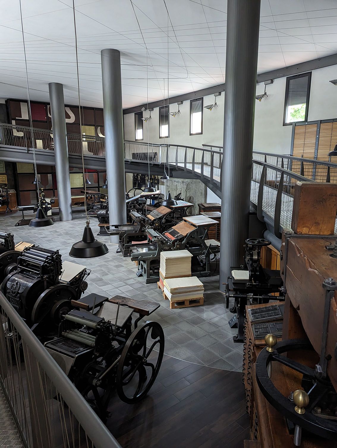
A part of the Tipoteca museum in Cornuda, the best museum on typography I've ever visited.
I learned that Eurostile wasn’t just the work of one genius. The capital letters were actually created by Alessandro Butti, who was the director before Novarese. He released them as Microgramma in 1952. Then in 1962, Novarese took it all to the next level, adding lowercase letters and expanding it into the Eurostile family we know.
I camped out at the museum for a solid ten days, immersing myself in the pages of the Nebiolo catalog. And boy, did I learn a lot. Not just from Novarese and Butti’s work, but also from Giuseppe Brachino, the master craftsman behind bringing their designs to life in metal. This guy knows his stuff when it comes to nailing those finer details. Looking at his adjustments between different point sizes really helped me shape my own decisions.
Here's a short film of Giuseppe Brachino cutting a punch and drinking a coffee. It's called The Last Punchcutter.
Speaking of shaping things, let's talk about those soft-cornered rectangles — those 'square wheels'. Much has been written about soft cornered rectangles and their construction - superellipses, hyper-ellipses, squircles, squigonometry, you name it. Eurostile nails it with its super-elliptical form, which is also at the heart of New Science. Controlling the stroke as it turns a 90° corner is the fundamental principle of the design. Trust me, if I explained the whole shebang, you'd be reading a dissertation, not a blog post.

The Four-Cornered Wheel, also known as a Lamé curve after Gabriel Lamé
Here’s the thing that fascinates me: those letterforms trigger some serious associations in our minds. And it's all thanks to the emphasis on soothing horizontal strokes. That's why the extended style of Eurostile is so popular - it really brings out those horizontal strokes on the baseline, x-height, and cap height. With very short ascenders and small cap height, the vertical strokes take a back seat. As those horizontals guide our eyes along with laser-like precision, we subconsciously feel a powerful motif for stability and control at speed. Their linear continuity is calm and reassuring.
That became the foundation of the New Science system. Standard carries the central voice: square, precise and controlled. Extended makes the horizontal force more architectural. Mono turns the same language into fixed-width typography for data, interfaces and technical communication. Serif adds a sharper, more editorial edge while keeping the underlying squared structure intact.

It’s really no wonder that these characteristics are so valuable to branding. They help us recognise businesses as being technological leaders, convince us that products have been developed to the highest scientific standards, and reassure us that we are served by organisations whose competence is indisputable.
Let’s fast forward a bit. Ruggero Magri and I spent a solid fifteen months working on New Science, and crikey, did we have fun! After we finished the extended width, Ruggero had a brilliant idea - why not create a monospace version? And you know what? Those wide serifs on the f, i, j and l really kicked the horizontal vibe up a notch. It was unexpected, and it brought a whole new energy to the font.
As we worked on the big slab serifs of the monospace version it reminded us of a serif typeface, also with square forms, that Alessandro Butti had designed before he'd done Microgramma. Quirinus, a monumental typeface, validated the idea of drawing a serif version.

Alessandro Butti's Quirinus, designed in 1939 for Nebiolo.
New Science, with its extended, monospace and serif styles, is the precision choice in a genre of fonts synonymous with performance and advancement.
New Science is the precision choice in a genre of typefaces associated with performance, control and advancement. Its Italian origins run through Eurostile, Microgramma, Nebiolo and Quirinus, but the finished family is built for contemporary brands that need a clearer technical voice.
Explore the New Science collection: Standard, Extended, Mono and Serif.