The Face of Tate
The story of a custom typeface
My best work serves the client and the audience equally. Talking and listening command equal respect, separately they are meaningless. Defining the role a typeface plays between writer and reader forms the backbone of the brief.

In 1999 Wolff Olins asked me to help rebrand the Tate Gallery. The work was to include a new logo and a custom typeface. The art institution had opened new sites in Liverpool and St Ives, and was about to inaugurate a huge new gallery at Bankside Power Station in London.
Like most galleries, the Tate’s fantastic collection of art supplies the imagery for their advertising and therefore most art institutions identities are typographic. For a custom typeface to work properly it needs to be seen often, which means using it across the complete spectrum of applications: logo, signage, posters, web, merchandise, and so on. The typeface for the Tate Gallery needed to walk the fine line between being uniquely identifiable yet sufficiently neutral to allow the art to have a voice.
Art dating back more than five centuries would traditionally be accompanied by a serif typeface. The challenge was to investigate whether a contemporary brand typeface would be appropriate next to a masterpiece from the sixteenth century. As art has been a guiding light since my early childhood, creating a typeface that would play a significant role in presenting art to as broad an audience as possible was close to my heart.

The intended use of a typeface is the functional brief. We can design purely utilitarian type for printing sell-by dates onto eggs, or arresting display alphabets calling people to action in times of crisis, or exotic letterforms for alien languages in sci-fi movies, and everything in between. The primary objectives for the Tate typeface were informing the audience, focussing their attention, inviting thought, and speaking to the general public in a non-institutional voice that was fresh and intelligible without dumbing down the material. Conceptually, the type would express the contemporary as it is informed by its predecessor, to show the possibilities of the present when inspired by an appreciation of the past.

The Tate Gallery’s competence was unquestionable. It didn’t need to be bolstered by adopting type that reassured the audience with its stature. The unique character of the Tate was the focal point, and this would unite the institution’s four locations. I chose to combine an unusual mix of references to create a distinct typographic identity, by basing the capitals on the classical proportions of Roman inscriptions, applying the geometry of 20th-century modernism to the lowercase, and keeping all letterforms open and rounding the terminals.

Wayfinding
Along the design and production process, the fonts were delivered in stages. The regular weight was the first to be handed over to the design team, to allow for testing the concept in key applications. This initial step demonstrated the type was comfortable to read in medium-length copy, and all-cap headlines didn’t shout. It is important to mention that the typeface and surrounding identity didn’t aim to describe Tate’s new ideas for the collection. They provided a conceptual space in people’s minds that enabled Tate to define what it wanted to be. They also invited the audience to think about art and to reflect on their leisure time as something they could define themselves. The Tate custom typeface was a massive success.
In the first years following the introduction of the new Tate brand, several variants of the typeface were designed for specific shows. The absence of mannerisms in its design – often called ‘ownable features’, a term used by foundries selling modified versions of their library as ‘custom type’– meant that what was ownable by Tate was at the very core of the design and not in superficial details. This aspect is often the most difficult thing to understand for creatives who commission custom type. There is always this temptation to identify conspicuous letters that make the typeface easier to sell to a client. However, these so-called ‘key characters’ tend to become ostentatious and eventually detract from the brand’s long-term value and confidence.

Posters

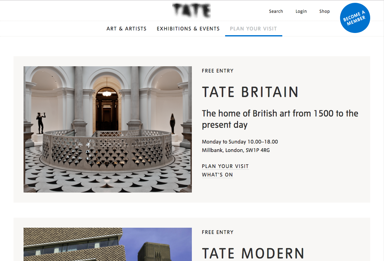
Website
As Tate developed, so did its type. The structural exclusivity allowed us to refresh the design several years later without losing the equity it had built up. A brand benefits more from continuous improvement than from flexibility. The fashion of flexible branding is a cover-up for indecision. It betrays a lack of confidence and ignores that things can be improved. Evolution is more potent than options. The agile process that we use at Newlyn allows for the reappraisal of a design from both a technological and an aesthetic point of view. Over the past decades, the Tate Gallery typeface has been revisited, optimised and refreshed, while remaining consistently Tate. In addition to our significant redraw in 2004, it has benefited from optimisations for new font technologies, extensions of the character set for increased language support, and the addition of supplementary figure styles and weights.
For the Tate Gallery, type has become an invaluable asset that confidently speaks to visitors from every part of the world. The custom typeface communicates about all things Tate, from the most mundane aspects like the price of a cup of coffee to its deepest inspirations as an art institution.