Cooper Black Made New
New Kansas is Miles Newlyn’s contemporary revival of Cooper Black, one of the most recognisable and emotionally direct typefaces of the twentieth century. Cooper Black is familiar, warm, populist and impossible to keep in one category: it belongs to record sleeves, food packaging, shopfronts, comedy titles, posters and brands that want to sound human.
This article explains why Cooper Black became so culturally embedded, what made Oswald Cooper’s design so enduring, and how New Kansas turns that inheritance into a practical modern type family with Roman, Italic, Swash and ExtraSwash styles.
Some things hold such a solid place in our collective consciousness that they seem completely natural. Unlike trends that come and go, there are common thoughts and experiences that we accept completely. Think of the colour blue in finance, fluffy bathrobes in a smart hotel, or giving flowers to express our feelings. These are not stuck within one specific timeframe but are accessible to all. When we use certain fonts, we access that same collective experience to express a universal feeling.

Exhibition Poster, 1971, published by Tate Gallery Publications, Millbank, London.
Cooper Black’s Fame
As a brand designer my job has been to make logos with specific emotional cues. It’s our collective experience that makes this possible. Typeface design works in a similar way, and if there’s one typeface whose force is strong, it’s Cooper Black. There have been other fonts made from the same idea, but none so ingrained in our collective experience as Oswald Cooper’s original.

Pork. I don’t know who designed this but it was published by The Roundhouse in 1971. I love it for the cool use of Cooper Black.
Cooper Black shows up nearly everywhere: movie and album titles, jewellery, airlines, and a range of shops from doughnuts to salons to tire repair, and everything in between. Cooper Black does not discriminate and this is what makes it an icon of pop-culture — something with a universal tone.
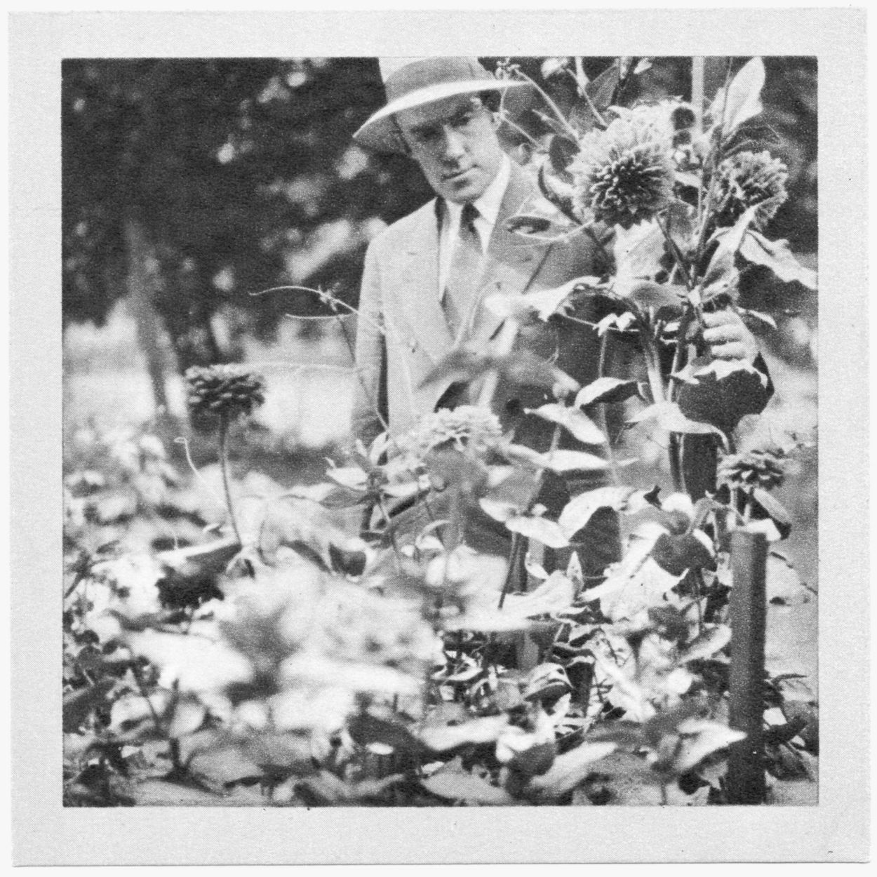
Oz Cooper with his prize winning flowers, 1929.
Oswald Cooper
Oswald Cooper (1879–1940) knew what he was doing. He was trained by and enjoyed friendship with some of the top type designers and calligraphers of his day, such as W. A. Dwiggins and Frederic Goudy. He was raised a midwesterner in Coffeyville, Kansas, who then moved northeast to work in a print shop in Chicago. Oswald Cooper’s midwestern humility was part of his personality and transferred into his work; the Cooper Black font was one of those results.
An early proof for Cooper Black which is lighter and has a smaller x-height than the final drawings.
Why Cooper Black Needed Reworking
Throughout my decades working with large brands and global events, I’ve researched the genre of ‘rounded’ fonts in-depth. Made in 1920, Cooper Black has an unmistakable tone but was not the product of our modern technology. I wanted to take the design and apply the lessons I’d learned to this holy relic in order to create a fully fledged type family for wide use.
We designed New Kansas because Cooper Black felt neglected. Many classic typefaces and styles have undergone numerous revivals and reinterpretations. But as one of the world’s most famous and most used typefaces of the past century, We were surprised that Cooper’s bulbous, oval serifs had not been modernised. There has been very little professional reappraisal of Cooper as a font family, and even less in that elliptical serif style.
With New Kansas we’ve done that — made a fresh, approachable family that’s ready to work hard and play hard for another 100 years.

Introducing New Kansas
New Kansas takes the populist force of Cooper Black and turns it into a broader, more useful type family. Its Roman styles range from Thin to Heavy, giving designers more control than a single nostalgic display face ever could. The lighter weights bring Cooper’s warmth into paragraph text and editorial settings; the heavier weights keep the punch, softness and charm that make the genre so memorable.
The family extends beyond Roman styles into Italic, Swash and ExtraSwash. That range allows New Kansas to move from practical brand typography to expressive headlines, packaging, logotypes, book covers, comedy titles and display work without losing its essential character.

New Kansas was originally intended for display use at 18 points and larger, but because of its tall x-height, the weights from light to bold can be used for paragraph text. This advance over its predecessor ensures New Kansas will be used time and again.
New Kansas carries a very non-corporate tone and is just downright fun to use. It is far more consistent as a family than Cooper. Its distinct personality is visible throughout the weights, an improvement over the original, whose lighter weights have become dated.

New Kansas’s look is governed by the fact that there are no sharp edges anywhere in the design. The convex serifs and medium contrast keep the family firmly in the category of blue-collar practicality, always cheerful and ready to serve. This makes the New Kansas font family a glutton for punishment — or at the very least, it begs to be used indiscriminately.
Comfortable Everywhere
New Kansas, like Oswald Cooper himself, didn’t attend a university. It doesn’t have a trace of irony or aspiration, but speaks everything as matter-of-factly as possible. It’s not perfect, not pedigreed, and has no desire to tell you about wine pairings. It’s as happy with a microwave dinner as it is with steak medallions and fennel salad. What New Kansas is is comfortable with itself. And it invites you to get comfy with it, too.
New Kansas keeps Cooper Black’s generous, everyman spirit, but gives it the range, consistency and control needed by contemporary designers. It is not a polite corporate serif and it should not try to be. Its value is that it can carry warmth, humour, appetite, familiarity and confidence without becoming timid.
Explore the New Kansas collection: Roman, Italic, Swash and ExtraSwash.