A New Windsor, in Spirit
Like a half-remembered dream entirely familiar, sort of comforting, but which can’t be pinpointed to a particular time or place -Windsor is both nostalgic and entirely enigmatic.

The legendary Manhattan venue Max’s Kansas City, perhaps most famous for the Velvet Underground live album recorded there.
Just what is it about Windsor?
Less ubiquitous than similar fonts such as Cooper, Windsor has an undeniable glint in its eye: certain gestures and wry flourishes suggest it can be as wild or well-behaved as you want it to be. Indeed, its enduring cult status is partly down to it being ‘rare ordinary,’ says type designer Miles Newlyn—a font that’s at once strikingly unusual, but somehow has a sense of the habitual. ‘It speaks to us of a naturally lived life—but one that’s not too civilised,’

The history of Windsor
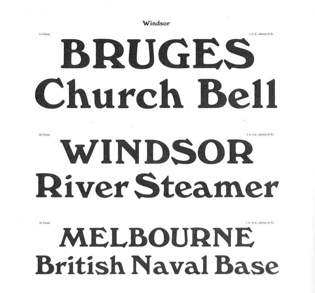
Windsor was designed by Eleisha Pechey, and released posthumously in 1905—years before Cooper Black (1922). Pechey was born on Christmas Day 1831 in Bury St. Edmunds, Suffolk; and completed an apprenticeship in printing and bookbinding before working as the London agent at Sheffield type foundry Stephenson, Blake & Co. from 1863 until his death in 1902. The foundry published all Pechey’s designs; and while he was recognised in his lifetime as an ‘inventive’ designer, his faces were cut by others, and Newlyn suggests Windsor ‘displays some amateurish qualities’.

Windsor signage in the derelict Stephenson Blake factory, Sheffield, 2007.
Windsor’s quirks bear clear reference to certain aesthetic touchpoints of its era. Its naturalistic shapes signal the French Art Nouveau style: take the R, with its exaggeratedly large bowl; the floral fanned terminal on 2 and other numerals; the rather avian beak-like serifs on S and s; Q’s distinctly tendril-like tail. ‘It’s an Arcadian typeface, by which I mean that it is from an artistic vision of stability, abundance and harmony with nature,’ says Newlyn. This sense of the organic, homemade and untainted by industry brings an undeniable romance to Windsor; tempered by its traditional aspects in nods to more conservative Oldstyle serif typefaces.

Stephenson, Blake & Co Ltd. 1924
New Spirit: Finally a versatile rework for the modern designer
So why—since there’s so much to love about Windsor—did it need a rework?
The original letterforms bear numerous strange inaccuracies, making them clunky in modern layouts. Plus, Windsor has only ever been released in three weights; Light, Bold and Ultra Heavy (Medium was never digitised), and of all the versions that are out there, ‘none are well digitised, spaced or kerned, and the quality of punctuation, symbols, maths and ligatures is shockingly bad,’ says Newlyn.
That—and a very personal love for the font—are behind Miles Newlyn’s New Spirit. The rework finally does Windsor justice across a thoroughly designed and useful range of weights; cementing its place as a 21st century icon, not just a curious relic of the 20th.
Miles Newlyn started working on New Spirit after completing his reworking of Cooper, New Kansas. ‘When I was in Iceland looking through a huge collection of beer labels I was struck by the interchangeability of Cooper and Windsor,’ he says. Newlyn has an ‘intimate affection’ for Windsor—it’s ‘added some magic to my life,’ he says, referring in part to his unusual hobby of collecting and restoring early model steam boats—their older catalogues and the few books on the subject mostly use Windsor.

Windsor Condensed used on the cover of the 102nd edition of the Steven’s Model Dockyard catalogue.

Elena Schneider, Leo Philp and Riccardo Olocco browsing Húsavík Museum’s huge beer label collection.
So what’s new about New Spirit?
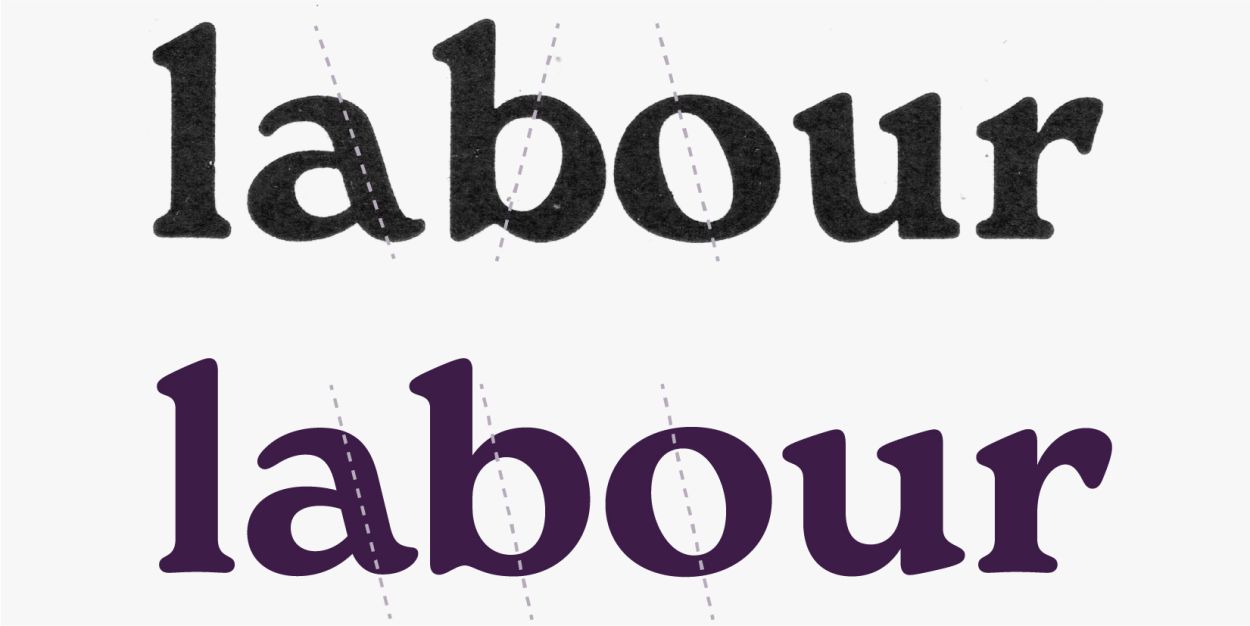
‘The most challenging thing about reviving an old design is deciding what to change,’ says Newlyn. ‘Windsor’s most distinct and challenging features are the angled legs on its h, m and n; since there was a risk that they would attract the eye and interrupt reading. The angle was a critical decision.’ In Windsor this angle varied greatly between weights and point sizes; and so a range of angles in text and display sizes were explored to reach one that’s comfortable to read across all weights. A set of more extreme letters with a greater angle is available as an Opentype feature.

Unlike Windsor, New Spirit’s capitals are consistent with its lowercase, and a broader appeal and versatility is achieved by subtly paring back any intrusive Art Nouveau features.
The most obvious of these features is the bottom heaviness of the letterforms, particularly apparent in the egg shaped O. Peschey was so rigorous with this bottom heaviness that the b and p had the weight moved from the top of the bowl to the bottom,’ says Newlyn. With the sagginess now gone from other letters, the b and p returned to their harmonious norm. Windsor’s flat feet were also remedied: ‘By cupping the serifs; giving the bottom of the serif a subtle rise in the centre, the design becomes livelier and less tiresome in text.’

Windsor (top) with its awkward reverse stressed b.
New Spirit’s enduring charms
Like the font it’s based on, New Spirit is at once refined in its marriage of Art Deco decadence, Oldstyle sensibilities and playful Art Nouveau. Now modernised for today’s tools and applications, designers everywhere can easily manipulate and handle this curiously artisanal, cheeky but seductive font.
‘I think that there are typefaces that designers have an affinity with and use because they feel themselves in it,’ says Newlyn. ‘Windsor is one of these because it’s such a creative design, it follows its own nonconformist path. It’s a beatnik, a bohemian.’
👉 Download the trial fonts , who wouldn't?